Make believe pain
The pain was strong and unrelenting. I decided to paint it.
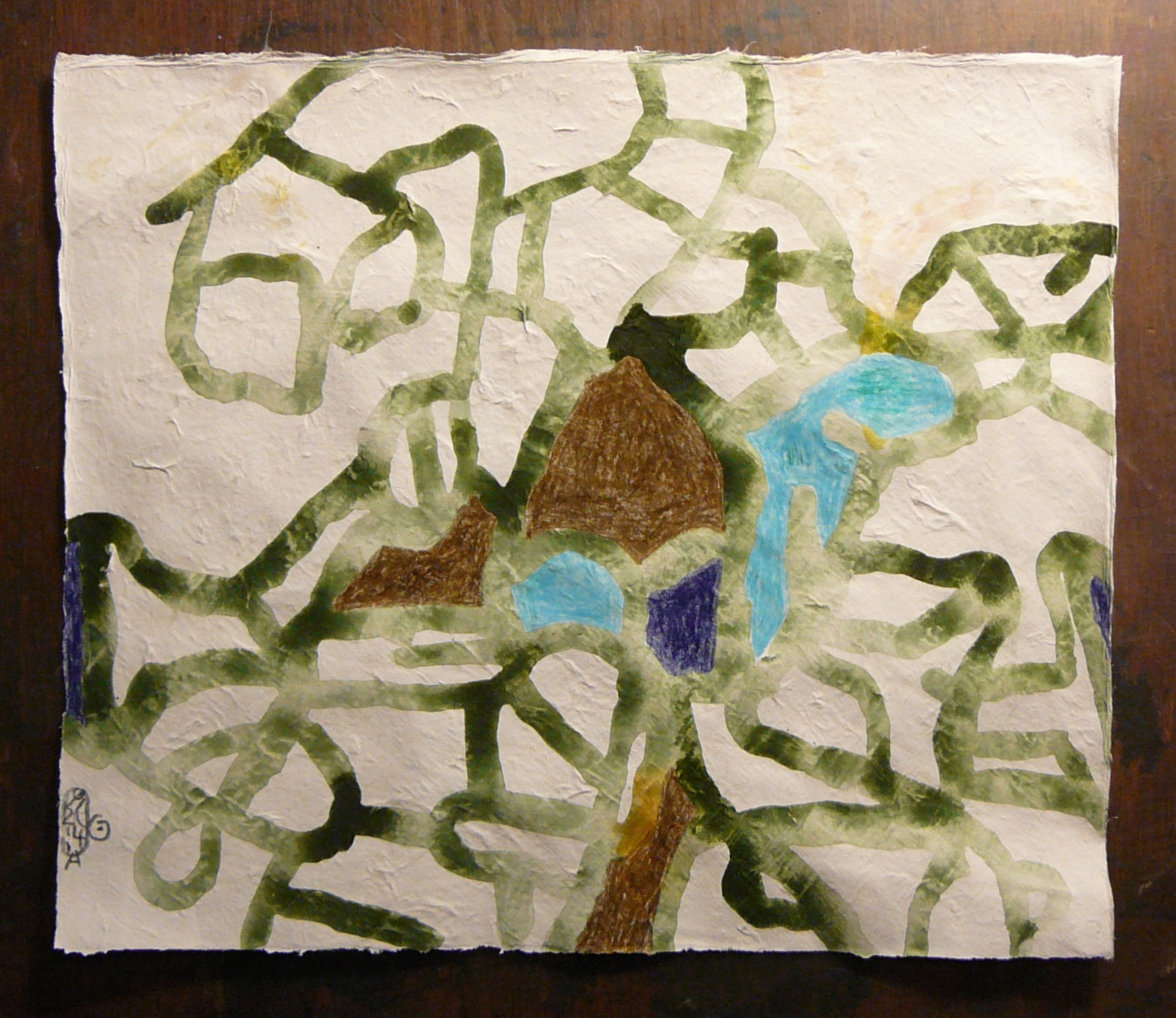
In the stage in which it was a drawing only, it expressed the craziness and strength of the pain quite effectively. When I added the colors the effect became somewhat weaker. The power of lines to affect the areas that they point at, was hindered by the viscosity of the colors and also by the effect of the colors. A body of color has an effect of its own and when you place different areas of color next to each other they influence each other and create yet another effect. All these added effects weaken, relatively, the effect that the lines had when they did not compete with the colors. Nevertheless, you can still see the craziness of the pain, the way it spreads in all contradicting directions. This contradiction creates a feeling of struggle and chaos. The chosen colors also cry out from the page. They radiate energy that refuses to settle. This adds to the expression of the power of the pain and the chaos. When you hold this picture in your hands you want to drop it or put it quickly in a box and cover it with a black cloth, to stop that radiation and protruding thorns.
Well, this is how I feel when the pain is so strong and persistent. And since I do not have any way to smother it, as I would have liked to do, I have to come to terms with it. And the most important part of coming to terms is to learn that my mood is not dependent on how my body feels. I can have this pain and still be in a good mood. I can even feel thankfulness to the pain for giving me the opportunity to learn that this is possible.
You may notice that the painting has this air about it of having been done for children. As if fear, danger and threat have been depicted here for a children’s book. Do you get this feeling?
This is due to this distance that I took from the pain, allowing it to be, and taking care of my mood separately. It is still very impressive in its effect, but its power to make me fear is reduced to a make believe fear. It is like a monster in a puppet theater. Even if death will result, it will be a make believe death.
There are two places where the colors that were used are dark and contrast strongly with their immediate environment. One is in the blue that is darker than all the other areas of color and contrasts strongly with the red lines that are touching it. It could have been an opening to the sky and a window to escape through, but the restlessness of the texture is pretty deterring and the strong red lines all around it make it feel dangerous to pass through. So there is no escape.
The other place is in the lower left corner, where the dark violet made the lines stand out so clearly that their drawing character is emphasized. The feeling that these lines give is more like wanting, longing, needing and complaining. Maybe the pain asks for attention, as love was not given at some point to something that wanted to be accepted and loved?